
Messenger Button for Auto Repair Websites
Quick answer
A messenger button for auto repair websites is usually the fastest way to let drivers ask about diagnostics, pricing, availability, or booking without digging through menus or long forms. The best setup is one visible button tied to a clear contact route, placed where mobile visitors can tap it quickly without blocking the call button, map, or scheduling flow.
This works well for independent mechanics, collision shops, tire centers, mobile repair services, and multi-location service garages that need faster lead capture from urgent visitors.
- One obvious message option for fast repair questions.
- Quick access to WhatsApp or another preferred channel.
- Placement that does not interfere with phone, map, or booking actions.
- A consistent contact path across service, quote, and contact pages.
Why this matters for auto repair websites
Can you add a messenger button to an auto repair website without coding?
How to set up a messenger button for auto repair websites
Step 1: pick the main repair conversation goal
Decide what the button is supposed to start. For most shops that means quote requests, service availability, booking questions, or quick diagnostics triage. Keep the first action narrow so the visitor knows what will happen after the tap.
Step 2: choose one primary channel
If most leads come from mobile, a single messenger route often works better than several competing buttons. Start with the channel your staff can answer reliably during working hours, then keep phone and forms as backups rather than equal floating actions.
Step 3: install the button once at site level
Place the script or widget globally so the same button appears on homepage sections, service pages, pricing pages, and the contact page. That consistency matters because many repair leads enter through one service page, not the homepage.
Step 4: place it around the existing contact stack
Test the button against sticky phone bars, map embeds, financing badges, estimate forms, and coupon banners. The common failure is not setup. It is a button that covers the phone CTA or the request-an-appointment block.
Step 5: keep a fallback for detailed service requests
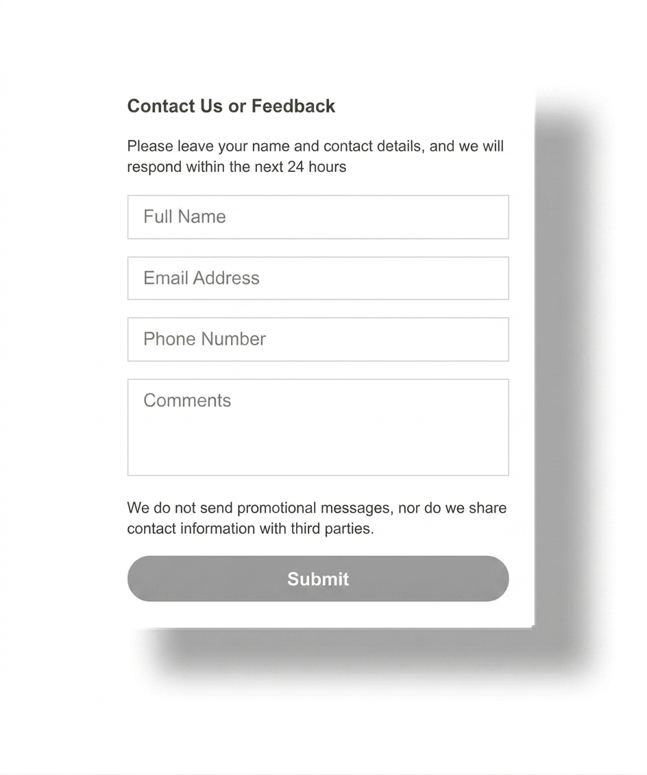
Some jobs need vehicle details, photos, VIN data, or a longer description. Keep a visible form or service request page for that path instead of forcing every lead into one short message flow.
Step 6: test on a real phone before publishing
Open the site on mobile, visit tire, brake, AC, diagnostics, and contact pages, then confirm that the messenger button stays visible without blocking sticky navigation, map directions, or call-now buttons.
Platform guidance for repair shop websites
WordPress and Joomla
Use one global script placement point in the theme, header, or custom code area. Avoid adding one plugin for each contact action if you only need one clear messenger button.
Wix and Squarespace
Use the platform's custom code area or supported embed path, then test the button on mobile templates because repair service pages often stack banners, forms, and maps tightly.
Webflow and HTML sites
A direct script insert is often the cleanest option because you control the global layout and can keep the button consistent across service templates and location pages.
Shopify service hybrids
If the site mixes service booking with tire or parts sales, keep the messenger button visible on service pages but test it carefully on cart and checkout-related screens so it does not distract from purchase actions.
Placement and UX best practices
The default position is usually bottom-right, but the better rule is to place the messenger button where it stays visible without covering the phone number, emergency call CTA, service scheduler, or map directions.
- Keep one clear floating launcher instead of several stacked contact bubbles.
- Show the button on high-intent pages such as brake repair, engine diagnostics, and request-a-quote pages.
- Use short supporting text only when it helps clarify that the button is for service questions or booking.
- Check mobile spacing around sticky headers, coupon bars, and location maps.
If your broader site strategy is still evolving, compare this page with Best Contact Widget for a Local Business Website and browse more patterns on the English blog.
Messenger button vs phone link or form
| Option | Best for | Weak spot |
|---|---|---|
| Messenger button | Fast first contact, quick quote questions, mobile visitors, after-hours follow-up | Needs a team process so messages do not sit unanswered |
| Phone link | Urgent calls, roadside help, same-day service confirmation | Many visitors are not ready to call immediately |
| Contact form | Detailed repair requests, parts requests, insurance work, fleet enquiries | Feels slower for simple questions and short mobile sessions |
Most repair sites perform better with a messenger button as the fast path, a phone link for urgent calls, and a form for longer requests. If you want a broader one-vs-many channel comparison, review the messenger buttons guide.
Common mistakes on auto repair websites
Hiding the button on service pages
Many shops only show a contact option on the main contact page. That misses visitors who land directly on brake, tire, AC, or diagnostics pages from search.
Letting the button cover the call CTA
If the floating button sits on top of the main phone action, urgent visitors lose the fastest path instead of gaining a better one.
Offering too many equal contact choices
Phone, SMS, chat, multiple messengers, coupons, and booking bubbles competing in one corner usually create more friction, not more leads.
Ignoring response expectations
A messenger button works only if someone actually answers. If the shop cannot monitor messages reliably, make the scope and hours clear instead of implying live support.
- Pick one primary message goal for repair leads.
- Keep the button visible on service and quote pages.
- Do not let it cover the phone number, map, or booking CTA.
- Keep a fallback form for detailed repair requests.
- Test mobile behavior on real pages before publishing.
Frequently asked questions about messenger buttons for auto repair websites
What is a messenger button for auto repair website pages?
A messenger button for auto repair website pages is a visible contact launcher that lets drivers open a fast message path for quote requests, repair questions, scheduling, or roadside enquiries without searching through the full site.
Can I add a messenger button for auto repair website pages without coding?
Yes. Most repair shop websites can add one hosted script or widget without custom development, then keep the same contact entry point across service, contact, and booking pages.
Will an auto repair messenger button work on mobile and desktop?
Yes, if you test it against sticky phone bars, map blocks, financing banners, and appointment forms. The button should stay easy to tap on mobile without covering the service advisor call-to-action.
Should I use a plugin, script, or app for an auto repair messenger button?
Use the lightest option your website platform supports. A script-based button is usually cleaner than stacking another plugin or app when the real goal is one fast contact route for service leads.
Is a messenger button better than a phone number or contact form for an auto shop?
For quick pricing, availability, and repair questions, a messenger button often beats a form because it feels faster. A phone link still matters for urgent calls, and a form still helps when a customer needs to send detailed information or upload context.
Where should I place a messenger button on an auto repair website?
The button usually works best in the bottom-right corner and on high-intent pages such as service pages, quote pages, and the contact page, as long as it does not cover the phone CTA, booking tool, or map.
Need a cleaner messenger button for your repair shop website?
Launch a no-code messenger button, keep service enquiries easy on mobile, and give drivers a faster way to contact your shop without rebuilding the site.