
MOBILE FLOATING CHAT BUTTON UX GUIDE
Mobile floating chat button UX works best when the button stays easy to reach, large enough to tap, and far enough from cookie bars, sticky CTAs, and bottom navigation. Use one sitewide script, test the real mobile viewport, and keep the action visible without blocking the page.

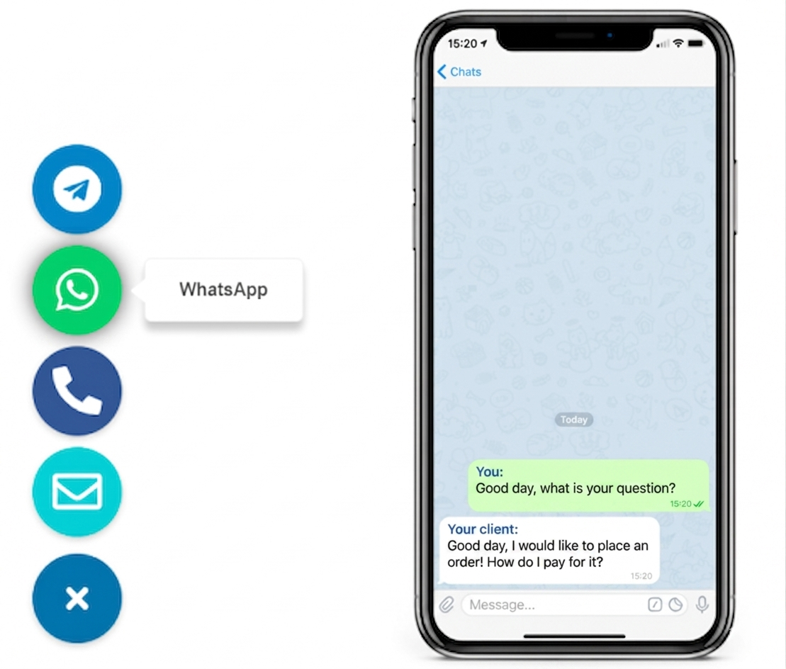
WHY MOBILE CHAT BUTTON UX MATTERS
because the same button that looks fine on desktop can easily become a mobile obstruction

If your platform gives you a custom-code area, you can install the button once, then tune position, spacing, label length, and channel choice around real mobile constraints instead of editing every page template separately.
How to set up mobile floating chat button UX in 6 practical steps
- Define the mobile contact action. Decide whether the button should open WhatsApp, Telegram, or a small channel chooser for quick first contact.
- Start with one clean placement. Use a bottom corner first, then confirm it does not collide with the site's existing sticky mobile elements.
- Set a finger-friendly tap target. Keep the button large enough to tap comfortably and avoid decorative padding that makes the visible icon look smaller than the real hit area.
- Adjust the offset for safe space. Leave room above cookie bars, sticky add-to-cart strips, browser bottom bars, and iPhone safe-area insets.
- Keep the message path short. Make sure the channel opens the right conversation quickly, with a clear label and no cluttered multi-step overlay.
- Test on real phones before publish. Scroll key pages, rotate the screen, dismiss consent banners, and confirm the button never blocks important mobile controls.
Platform guidance
WordPress: place the script sitewide, then test the button against sticky mobile headers, cookie plugins, and checkout bars instead of relying on desktop preview only.
Shopify: check product pages and cart-related sticky bars carefully, because mobile floating buttons can compete with add-to-cart controls.
Wix: use the custom code area and review the live mobile layout, since editor previews may not reflect every overlap.
Webflow: add the snippet in project settings and verify interactions with bottom navigation, cookie banners, and collection page layouts.
Joomla: keep the button outside article bodies and review template-level mobile spacing after each position change.
HTML website: add the snippet before the closing body tag and test the actual viewport on iOS and Android, not only responsive desktop mode.
- Install the button globally, not in isolated content blocks
- Use one script when the platform allows it
- Leave enough bottom offset for consent and sticky UI
- Check tap comfort with one hand on a real phone
- Confirm the messenger opens correctly from mobile browsers
For broader setup context, see the floating chat widget guide and browse the YourChat blog for related examples.
Placement and mobile UX best practices
Thumb reach first
Place the button where a right- or left-handed user can reach it naturally without chasing it around bottom navigation or browser chrome.
Give it breathing room
The button needs visible spacing from cookie bars, sticky purchase strips, and OS safe areas so it reads as intentional instead of jammed into the corner.
Keep the action simple
A short label, one primary messenger, and predictable open behavior usually beat a crowded mobile menu with too many icons.
If the button feels easy to notice, easy to tap, and easy to ignore when it is not needed, the mobile UX is usually in a healthy range.
Mobile floating chat button vs static contact link
When the floating button is better
- You want the contact action visible while visitors scroll
- Your audience prefers fast messaging over form filling
- You need a thumb-friendly CTA on service and product pages
When a static link still helps
- You already have crowded sticky UI at the bottom of the screen
- Your page needs full contact details, not just a quick chat entry point
- You want a fallback option alongside the floating button
Many sites use both: a floating button for fast mobile conversations and a quieter fallback contact path elsewhere on the page. If you need a narrower mobile-only placement angle, see this WhatsApp mobile placement guide.
Common mistakes
- Using the same offset on desktop and mobile without checking the smaller viewport
- Letting the button overlap cookie notices, tab bars, or sticky purchase controls
- Making the icon visible but the tap target too small for comfortable thumb use
- Adding too many channels and turning one contact action into a cluttered mobile menu
- Testing only inside responsive browser mode and skipping real devices
- Forgetting a fallback contact path on pages where visitors need more detail
Before you publish
- The button sits clear of cookie banners and sticky mobile controls
- The tap target feels comfortable on a real phone
- The chosen channel opens the correct messenger destination
- The label is short enough for small screens
- You still provide a fallback contact option where needed
Frequently asked questions about mobile floating chat button UX
What is mobile floating chat button UX?
It is the set of placement, size, spacing, and behavior choices that make a floating chat button easy to tap on a phone without covering important page controls.
Can I set up a mobile floating chat button without coding?
Yes. Most sites can install one script in a global code area, then adjust the button label, channels, and offset without rebuilding the mobile layout.
Should the button behave the same on mobile and desktop?
The visual style can stay consistent, but the mobile version usually needs more spacing from bottom bars, larger tap targets, and stricter overlap checks.
Should I use a plugin, app, or one script for a mobile floating chat button?
If your platform allows custom code, one script is usually the cleanest option. Use a plugin or app only when platform restrictions make sitewide placement harder.
Is a mobile floating chat button better than a static contact link?
Usually yes for fast conversations, because the action stays visible while visitors scroll. A static link still helps as a fallback on pages where visitors expect fuller contact details.
What is the biggest mobile UX mistake with a floating chat button?
The most common mistake is letting the button overlap cookie banners, sticky purchase bars, bottom navigation, or other mobile controls that already compete for thumb space.
Build a mobile floating chat button that feels natural on the page
Keep the setup simple, choose one clear messenger path, and make sure the button works with mobile reality instead of fighting it. When you are ready to launch, create the widget and test it on the pages that drive the most contact intent.