
Telegram Button for WooCommerce Product Pages
A Telegram button for WooCommerce product pages works best when it gives shoppers one fast question path without covering add-to-cart, variation selectors, or sticky mobile purchase controls. The cleanest setup is usually one lightweight no-code widget placed at template level and tested on real product layouts.
What this page covers
How to place a Telegram button around product-page buying actions, which setup path fits WooCommerce best, and what to test before making it live.
Who this is for
Store owners, marketers, and developers who want a simpler pre-sales contact option on product pages without turning the storefront into a heavy chat experience.
Why this matters on product pages
WooCommerce product pages carry the most important conversion UI on the store: price, variations, stock state, shipping cues, trust signals, and the add-to-cart path. A Telegram button can help when a visitor needs a quick answer before buying, but it has to support that flow instead of competing with it.
Can you do it without coding?
Yes. Most stores do not need to edit every product page manually. One theme-level placement or hosted widget is usually enough for a consistent Telegram button across product templates. If you want the broader sitewide version first, read How to Add a Telegram Button to Website. For more supporting articles, browse the English blog.
How to set up a Telegram button for WooCommerce product pages
Step 1: decide which product questions should go to Telegram
Use Telegram for fast pre-sales questions such as size, stock, delivery timing, or product fit. Keep refunds, warranty claims, and detailed support in a separate flow if they need more structured information.
Step 2: choose one consistent placement across product templates
WooCommerce stores often mix default templates, page builders, upsell modules, and sticky mobile purchase bars. Start with one stable button position that behaves the same on simple, variable, and bundled product pages.
Step 3: install at theme or widget level, not product by product
A template-level setup is easier to maintain and less error-prone than editing dozens of individual products. The goal is one contact path that stays consistent as the catalog grows.
Step 4: test spacing around add-to-cart actions
Check the gallery, variation selectors, quantity field, add-to-cart button, sticky cart bar, and any sticky coupon or free-shipping messages. The Telegram button should stay visible without sitting on top of revenue-driving UI.
Step 5: keep a fallback for longer or structured requests
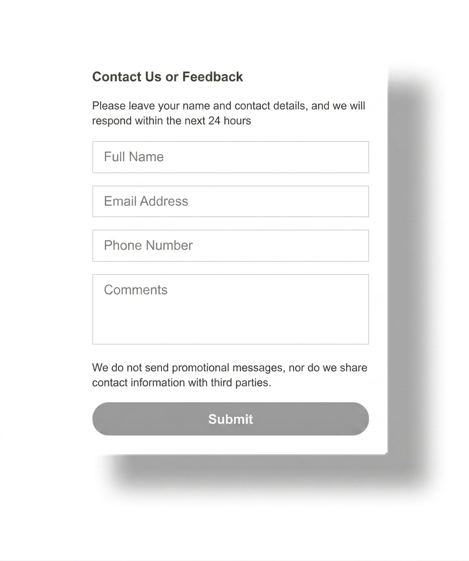
A product inquiry form, email route, or support page still helps when buyers need a written quote, an attachment, or a longer explanation. Telegram should shorten friction, not replace every support workflow.
Step 6: test real mobile product pages before launch
Most WooCommerce buying journeys break on mobile first. Test portrait screens, sticky bars, zoom states, and product tabs so the button stays helpful on the exact layouts that convert traffic.
Platform-specific guidance
WordPress: keep the button at theme or global widget level so it survives template edits and product updates.
WooCommerce: test simple, variable, grouped, and mobile sticky-cart product pages before considering the job done.
Shopify: the same placement logic applies even though the tooling is different. If you also run Shopify storefronts, compare this with a cleaner storewide setup.
Wix: use one contact action and test around product galleries, announcement bars, and mobile bottom bars.
Webflow: script placement is usually easier when product page layouts are reused across CMS or ecommerce templates.
Joomla / HTML: the lighter the contact layer, the easier it is to keep product pages readable and stable.
Placement and UX guidance for WooCommerce product pages
1
Above the fold
Do not let the button steal attention from the first buying decision. The price, variations, and primary cart CTA should stay visually stronger than the contact action.
2
Around sticky mobile UI
This is where most overlap problems happen. Test the button against sticky add-to-cart bars, cookie banners, and product gallery controls on smaller screens.
3
Below reviews and support content
Telegram works well as a quick clarification option near FAQs, shipping notes, and trust signals, where buyers often pause before they commit.
Telegram button vs product inquiry form
| Option | Best when | Weak point |
|---|---|---|
| Telegram button | Visitors need one fast answer before buying and you want a lighter contact path. | Not ideal for long, structured, or attachment-heavy requests. |
| Product inquiry form | You need product IDs, quantities, customization details, or quote-ready information. | Slower to fill out and easier for shoppers to postpone. |
| Full live chat | You have staffed support and need multiple conversations in parallel. | Heavier UI and more clutter on already busy product pages. |
For many stores, the best answer is not replacing everything with Telegram. It is using Telegram for quick pre-sales questions while keeping a clearer fallback for detailed requests.
Common mistakes
Covering the add-to-cart flow
If the button overlaps variation selectors, sticky add-to-cart bars, or product zoom controls, it hurts the exact page intent you want to support.
Adding Telegram to every support scenario
Telegram is strongest for quick questions. Use a fallback for returns, claims, or requests that need a structured intake.
Testing only one product type
Simple products may look fine while variable or bundle layouts break the spacing. Test the full catalog pattern, not one page.
Stacking too many floating elements
If the page already has a wishlist icon, cookie prompt, sticky coupon, and chat bubble, another button can quickly become visual noise.
Quick checklist before you publish
- Keep one Telegram button, not several competing floating actions.
- Check simple, variable, and mobile sticky-cart product pages.
- Leave clear visual priority for price and add-to-cart controls.
- Keep a fallback path for longer or structured requests.
- Test product gallery, review tabs, promo bars, and cookie notices.
- Review the broader setup flow in the Telegram button setup guide if you need a sitewide starting point.
Frequently asked questions about WooCommerce Telegram buttons
What is a good telegram button for woocommerce product pages?
A good Telegram button for WooCommerce product pages stays visible near buying decisions without covering the add-to-cart button, variation selectors, sticky bars, or product gallery controls.
Can I add a Telegram button to WooCommerce product pages without coding?
Yes. Most stores can use a hosted widget or one script placement at theme level, then manage the button settings without editing every product page separately.
Will a WooCommerce Telegram button work on mobile and desktop?
Yes, if you test both layouts carefully. The button should remain easy to reach without overlapping sticky add-to-cart bars, variation pickers, coupon bars, or review tabs.
Should I use a plugin or a script for WooCommerce product pages?
Use the lightest option that gives consistent placement. A script-based button is often cleaner when you want one Telegram contact path across product templates instead of maintaining several plugin widgets.
Is a Telegram button better than a product inquiry form?
Telegram is usually better for short pre-sales questions and fast clarifications. A product inquiry form still works better when you need structured details, file attachments, or a longer request trail.
Where should I place a Telegram button on a WooCommerce product page?
The bottom-right corner is the most common choice, but the best position is the one that stays visible without covering image zoom, add-to-cart actions, sticky mobile controls, or important trust elements.
Need a cleaner Telegram button for WooCommerce product pages?
Launch a lightweight no-code contact button, protect your product-page conversion flow, and give shoppers one faster way to ask before they leave.