
WhatsApp Button for Framer Websites
Quick answer
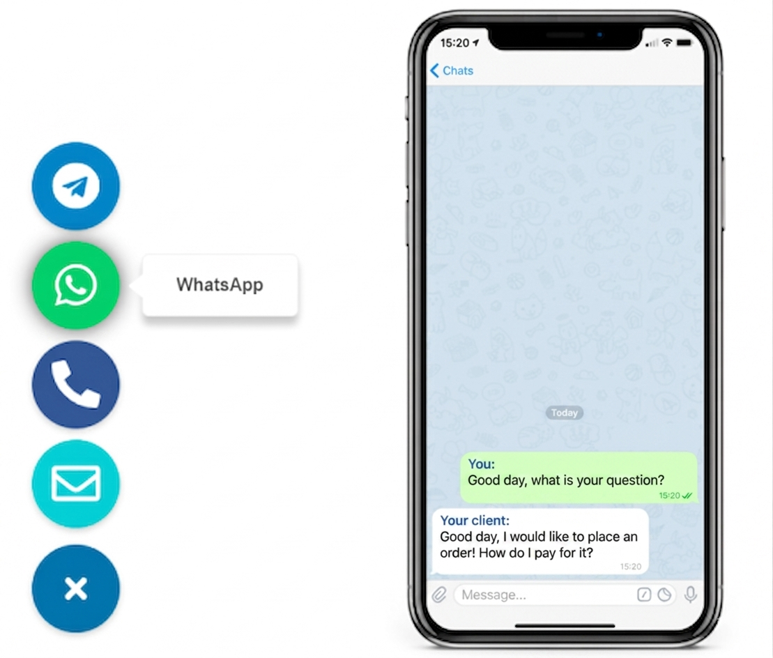
A WhatsApp button for Framer works best as one lightweight floating contact button that opens fast, stays visible on mobile and desktop, and does not block sticky navigation, announcement bars, or the main CTA. For most Framer sites, the cleanest setup is a no-code widget or one simple embed step that keeps the button consistent across landing pages.
This fits consultants, agencies, creators, SaaS teams, and service businesses that want faster pre-sales or booking questions inside WhatsApp without turning a polished Framer layout into a cluttered support interface.
Why this matters on Framer
How to set up a WhatsApp button for Framer websites
Step 1: define the exact contact use case
Start with one clear job for the button. WhatsApp works well for quick pre-sales questions, quote requests, booking checks, product clarifications, or lead qualification. It is less useful for long intake flows that need files, structured forms, or many fields.
Step 2: choose one sitewide placement
Framer pages often mix hero CTAs, sticky headers, mobile menus, and scroll-based sections. One clear contact button is easier to trust and easier to keep consistent than several different floating actions.
Step 3: add the button through one shared setup point
Place the WhatsApp button through a sitewide embed or shared component so it appears consistently across the homepage, landing pages, services, pricing, and contact sections. That is usually cleaner than adding separate blocks page by page.
Step 4: test the button against Framer UI elements
Check overlap with sticky nav bars, cookie notices, mobile menu triggers, announcement bars, bottom CTAs, and scroll effects. The common failure is not installation. It is a button that covers the exact action you want visitors to take.
Step 5: keep a fallback for detailed enquiries
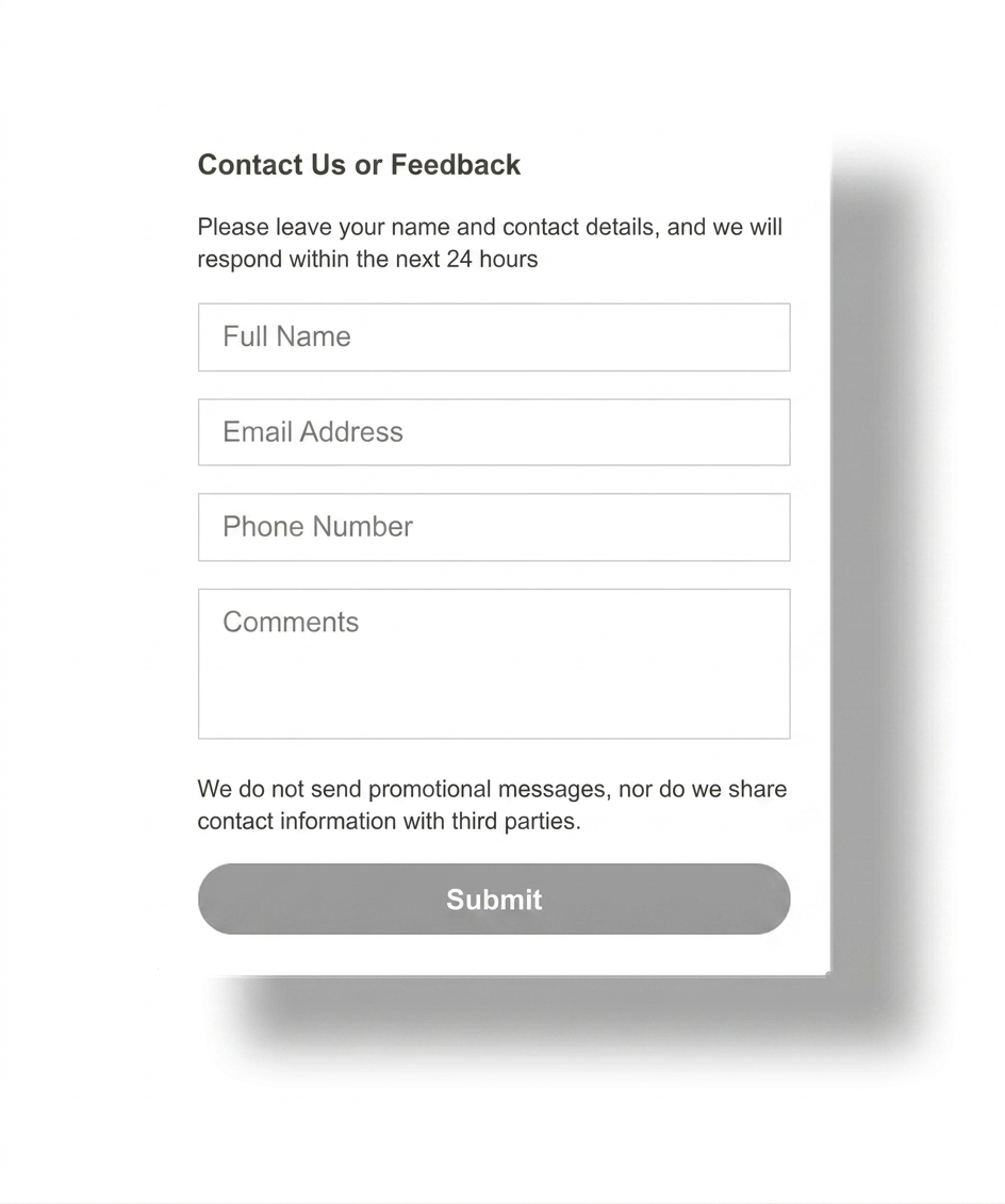
Leave a form or contact page for longer requests, project briefs, and attachments. A WhatsApp button should reduce friction for quick questions, not replace every contact path on the site.
Step 6: verify the mobile tap path on real pages
Open the Framer site on a real phone, scroll the homepage, open a pricing or service page, and test the WhatsApp tap flow. If the button blocks sticky CTAs or footer controls, adjust spacing before launch.
Platform-specific guidance
- Framer: test sticky headers, announcement bars, and bottom mobile CTA space first.
- WordPress: keep the setup light if you only need one WhatsApp button.
- Shopify: protect sticky cart and product conversion elements.
- Wix and Webflow: leave enough space around form and hero CTAs.
- Joomla and HTML: keep one sitewide source of truth for the button.
Placement and UX guidance for Framer pages
1
Homepage and landing pages
Let the button support quick questions, but do not let it compete with the main offer, demo CTA, or signup button in the first viewport.
2
Pricing and service pages
This is where WhatsApp often helps most. Keep it visible, but never over sticky CTA bars, pricing tables, or primary conversion buttons.
3
Contact and long-form pages
Use WhatsApp as the fast option, not the only option. Visitors with detailed requests still need a structured form or contact page.
Which Framer contact option should you use?
| Decision point | Plain contact form | WhatsApp button | Heavy live chat layer |
|---|---|---|---|
| Best for | Detailed enquiries, structured briefs, and requests with attachments. | Fast pricing, service, booking, or product questions. | Teams that truly need a broader support workflow on-site. |
| Design impact | Low, but less immediate for visitors. | Low when the button is lightweight and well placed. | Can add more UI, more settings, and more layout friction. |
| Mobile fit | Good when the form is short and readable. | Strong when the audience already uses WhatsApp on mobile. | Mixed if popups and floating layers crowd the screen. |
| When to prefer it | When the visitor needs to send detailed information. | When one direct conversation can remove hesitation quickly. | Only when your site needs more than a simple contact path. |
Should you use a Framer embed, custom code, or a heavier plugin-style setup?
Common mistakes
Treating WhatsApp like the only contact route
Quick questions fit well. Long project briefs, support issues, and structured intake still need a form or dedicated contact page.
Covering Framer mobile UI
If the button overlaps sticky navigation, bottom CTA bars, or mobile menus, it directly harms the conversion path it should support.
Adding too many floating actions
Visitors should not choose between several chat buttons, a popup, and a signup prompt at the same time. One clear contact entry point is easier to understand.
Skipping tests on real Framer pages
A layout that looks clean on a blank canvas can fail on a pricing page, CMS landing page, or mobile sticky-CTA layout.
- Define whether WhatsApp is for sales questions, bookings, support, or one specific flow.
- Place the button once in a sitewide Framer setup point.
- Check overlap with sticky headers, cookie notices, and mobile CTA bars.
- Keep a form or contact page for longer requests.
- Test the full click path on one real phone and one desktop browser.
Frequently asked questions about Framer WhatsApp buttons
What is the best WhatsApp button for Framer websites?
The best WhatsApp button for Framer websites is usually one lightweight floating button that stays visible, opens fast, and does not cover sticky navigation, cookie notices, or mobile CTAs.
Can I add a WhatsApp button to Framer without coding?
Yes. Most Framer sites can use a no-code widget or one simple embed step instead of rebuilding each page section manually.
Will a Framer WhatsApp button work on mobile and desktop?
Yes, if you test both layouts. The button should stay easy to tap without covering Framer navigation, sticky bars, or primary conversion buttons.
Should I use a Framer embed, custom code, or a script for a WhatsApp button?
If you only need one WhatsApp contact path, a lightweight embed or script is usually cleaner than adding a heavier chat layer with extra UI and settings.
Is a WhatsApp button better than a contact form on Framer?
WhatsApp is often better for short pre-sales or booking questions. A contact form stays better for detailed requests, files, or structured project intake.
Where should I place a WhatsApp button on a Framer website?
The bottom-right corner is the common starting point, but the best position is the one that stays visible without blocking mobile menus, announcement bars, or page-level CTAs.
Need a cleaner WhatsApp button for your Framer website?
Launch a lightweight no-code contact button, keep your Framer layout cleaner, and give visitors one faster way to ask before they leave the page.